Behind The Design
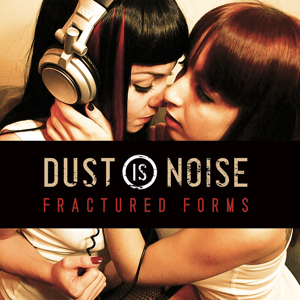
I chose to design this release in a very grungy and chaotic style to match the energy and intensity of the music. I also chose to use orange as this color is often regarded as the most controversial color. Anyone who is familiar with industrial music knows that Rachel is one of the most controversial people in the industrial music scene. In addition to supplying the photograph on the cover, she provided many ideas that appear in the album’s design.Contact me if you need packaging for your upcoming release!


