

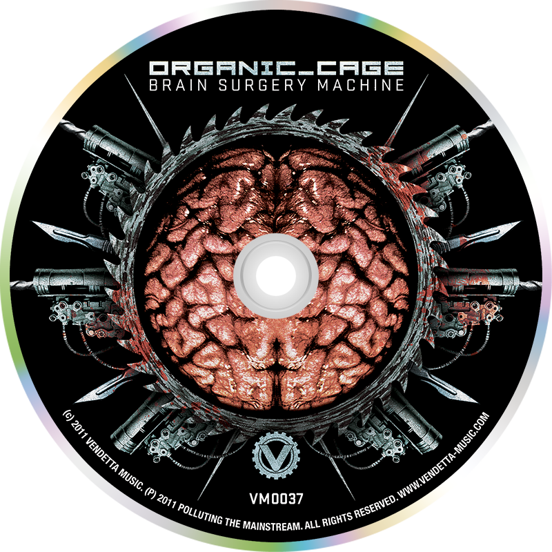
Behind The Design
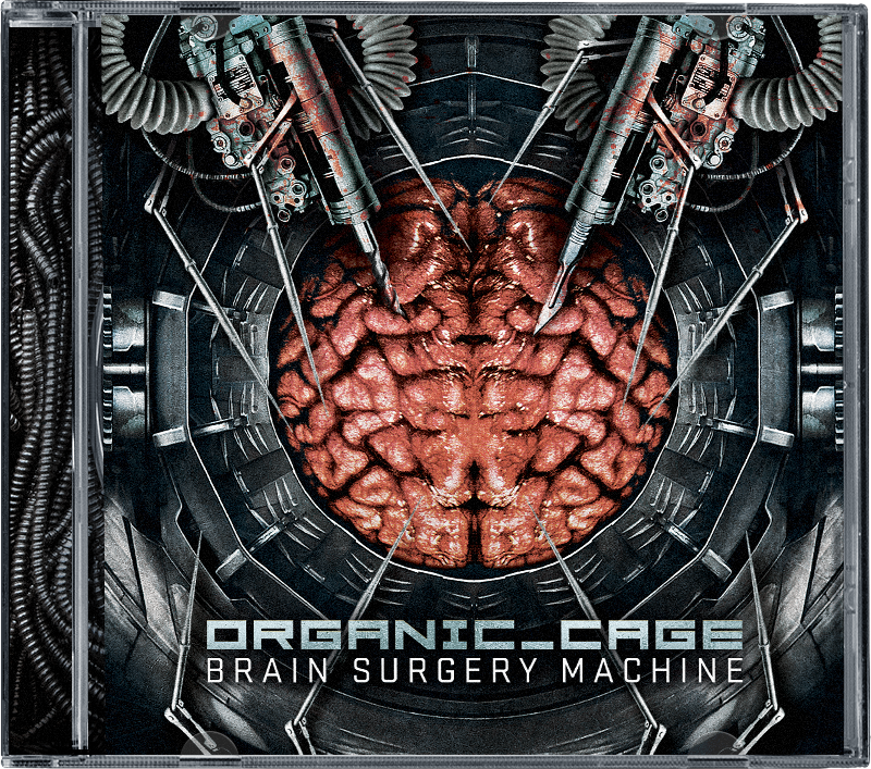
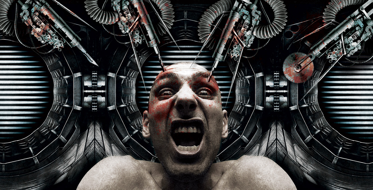
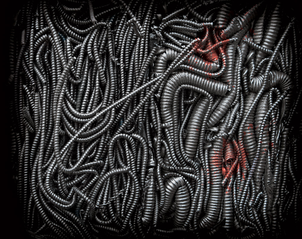
The client asked for “creepy biotech” mixed with elements of horror and science fiction. The artwork is an interpretation of the album’s title: a machine that performs surgery on the brain. I wanted to keep the design dark with just a tinge of grunge. I chose to use cool colors rather than warm colors to give it a cold medical look and feel.
Contact me if you need packaging for your upcoming release!